Introduction
Imagine this: A customer opens your website on their smartphone — the layout breaks, the text looks tiny, and the buttons don’t work. Within seconds… they exit.
Now imagine the same user landing on a clean, mobile-friendly website that loads fast and perfectly fits their screen. They stay, explore, and convert.
That’s what Responsive Web Design (RWD) does for your business.
With over 60% of internet traffic coming from mobile devices, if your website doesn’t adjust automatically to different screen sizes, you are losing traffic, leads, and revenue.
In this guide, we’ll explore the Top 10 Advantages of Responsive Web Design and why it has become a non-negotiable investment for businesses in 2026 and beyond.
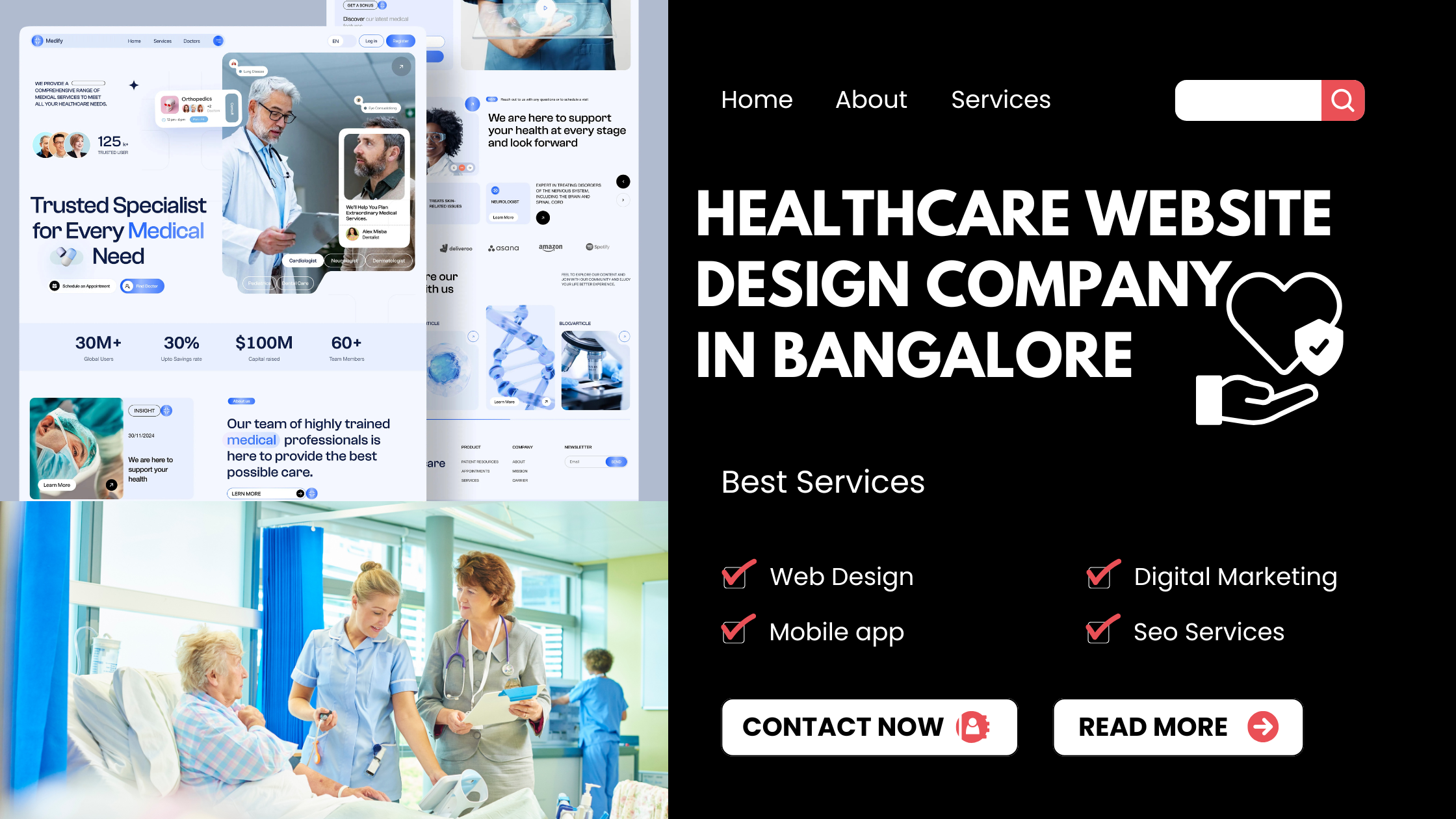
What is Responsive Web Design?
Responsive Web Design (RWD) is a modern web design approach that allows a website to automatically adjust its layout based on the user’s screen size — desktop, tablet, or mobile.
It uses:
- Flexible grids
- Scalable images
- CSS media queries
Example:
When you open Amazon or Flipkart on a laptop and then on a mobile phone, the content rearranges itself for a perfect viewing experience. That’s responsive design in action — flexible, accessible, and visually consistent.
Responsive design prevents common layout issues that impact user experience and ensures your website performs flawlessly across devices.
Why It Matters Today
Google now uses mobile-first indexing, meaning your mobile website decides your SEO ranking.
A non-responsive website = lower search rankings, higher bounce rates, and fewer conversions.
Businesses now depend on responsive web design services to ensure:
- Higher visibility on Google
- A seamless user experience
- Improved lead generation and conversions
Responsive design is no longer optional — it’s mandatory for growth.
Top 10 Advantages of Responsive Web Design
1. Cross-Device Reach with a Consistent User Experience
Users switch between phones, tablets, and desktops. A responsive website automatically adapts to any screen size while keeping design and functionality intact.
📌 Example:
A restaurant with a responsive website enables customers to easily view menus, check directions, and book a table — increasing walk-ins and online orders.
💡 Pro Tip: Test your site every month on different devices to ensure pixel-perfect responsiveness.
2. Improved SEO & Higher Organic Visibility
Google ranks mobile-friendly websites higher.
With one responsive site, all SEO ranking signals — backlinks, user engagement, URL authority — point to a single site, boosting SEO performance.
Example:
A digital marketing company in Bangalore saw a 30% increase in organic traffic within 60 days after switching to responsive design.
3. Faster Loading & Better Performance
Speed = conversions.
Responsive websites load faster due to optimized images, reduced code, and streamlined layouts.
Example:
Walmart reported that every 1-second improvement in load time increased conversions by 2%.
4. Lower Maintenance & Development Costs
Instead of maintaining separate desktop and mobile versions, one responsive website works everywhere — saving time and cost.
Example:
A software development company achieved a 40% reduction in maintenance costs after moving to responsive design.
5. Higher Conversion Rates
Visitors convert when the browsing experience feels smooth — responsive design delivers exactly that.
Example:
An e-commerce fashion brand saw a 25% increase in mobile sales after switching to responsive design.
Pro Tip: Make CTA buttons “thumb-friendly” for mobile screens.
6. Future-Proof Design
From foldable phones to smart TVs, new screen sizes appear every year. Responsive design adapts automatically without redesigning the entire site.
7. Consistent Brand Identity
A responsive website ensures your colors, fonts, and design aesthetics stay consistent across all devices. Consistency = trust and brand recall.
Example:
Apple delivers a premium experience across all devices — that’s consistent brand delivery.
8. Simplified Analytics & Tracking
Managing multiple site versions complicates analytics. With one responsive website, all tracking is unified.
Example:
A digital marketing agency migrated to responsive design. With GA4, they could analyze all device traffic on a single dashboard.
9. Better Accessibility & Usability
A responsive design helps users — including those with disabilities — navigate your website easily.
📌 Example:
Government sites like India.gov.in follow responsive and accessibility standards to ensure reach for all users.
10. Competitive Advantage
In crowded markets, user experience becomes a differentiator.
Example:
A responsive web design agency used mobile-first portfolios and saw a 50% increase in project inquiries.
What’s Next? How to Make Your Website Responsive
- Test your site using Google’s Mobile-Friendly Test
- Fix issues like image sizes, button spacing, and layout alignment
- Work with a professional web design or UI/UX agency
- Track results and conversion improvements
Bonus: Quick Site Audit Checklist
| Question | If Answer is NO → You Need Responsive Optimization |
| Does your website fit perfectly on mobile screens? | ❌ |
| Does it load in under 3 seconds? | ❌ |
| Are buttons thumb-friendly? | ❌ |
| Is your navigation clean and visible? | ❌ |
Conclusion
Your website is the digital face of your brand.
Responsive web design ensures it performs beautifully — on any screen, anytime.
From higher SEO rankings to increased conversions and improved brand credibility, responsive design is the smartest investment your business can make today.
Don’t wait until customers leave.
👉 Go responsive, boost your business, and stay ahead of competitors.
FAQs on Responsive Web Design
1. What is responsive web design?
A design method that allows your website to adapt to any screen size.
2. Can an old website be made responsive?
Yes. Developers can re-code your layout without rebuilding the entire website.
3. Is responsive design good for SEO?
Absolutely. Google prefers mobile-friendly websites.
4. Responsive vs. Adaptive design — what’s the difference?
Responsive adjusts fluidly; adaptive uses fixed layouts. Responsive is future-proof.
5. How much does responsive web design cost?
Depends on complexity, but it’s cheaper long-term since you manage only one website.